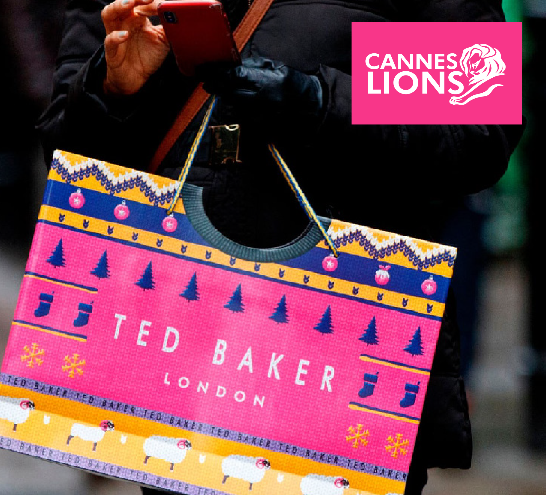

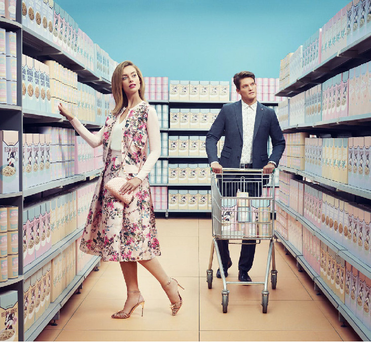


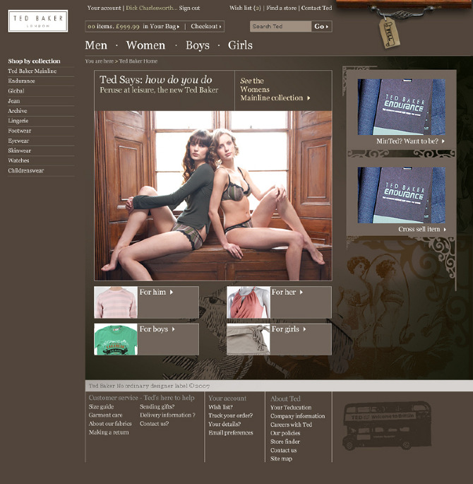
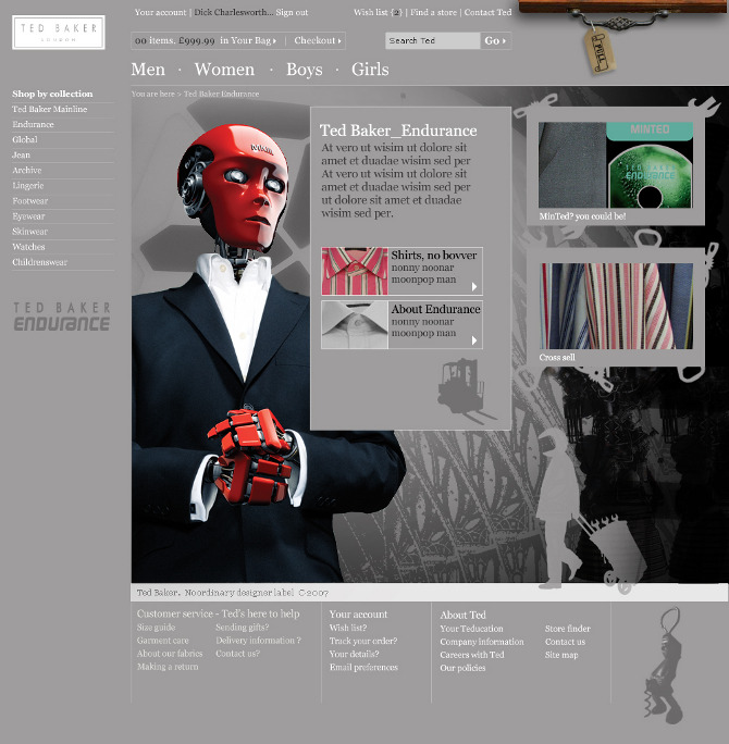

The Creative Brief
The brief was simple: create a revenue-generating eccommerce site, with a sprinkle of eccentricity, that reflected the brand.
We created the “Ted’s the Business” campaign.
The campaign was my first entry into the User Experience space, blending research into user behaviour, technology constraints, creative demands into a user interface that worked for all the competing requirements, and stayed true to the customer.
As Version 1 of Ted Baker’s entry into the world of ecommerce, the flagship site has gone on to account for a significant proportion of the company’s sales, since launch. Continuing and building on the direction I began 20 years ago, the current emanation of the site still reflects many of my early UX principles.


